
Good luxury brand website design does what a flagship store does: it gives the product space, slows the visitor down and makes every detail feel deliberate. In practice that means restraint (fewer elements, more white or black space), slow and precise motion, large confident typography, real photography and a site that loads fast. Spectacle has a place, but mostly for launches and limited editions.
Here is how each of those works on screen, and where brands get it wrong.
Restraint is the luxury signal
Mass-market sites compete for attention: banners, badges, countdown timers, five calls to action above the fold. Luxury brand websites do the opposite. One image. One line. One action. Absence reads as confidence.
What restraint looks like in a build:
- One subject per screen. A product, a material, a face of a watch. Nothing competing.
- Generous spacing. Margins that would look wasteful on a discount site.
- A tight palette. Usually two neutrals and one accent, used sparingly.
- Few, quiet interface elements. Thin lines, small labels, a menu that stays out of the way.
- No urgency tricks. Countdown timers and "only 3 left" banners cheapen the brand fast.
Slow motion, precise motion
Motion on luxury websites should feel like a well-made hinge: smooth, weighted, never bouncy. Some working rules we use:
| Element | Mass-market feel | Luxury feel |
|---|---|---|
| Image reveal | Fast slide, 200-300 ms | Slow fade or mask, 800-1,200 ms |
| Easing | Springy, overshoots | Long ease-out, settles gently |
| Hover | Color flash, scale up | Subtle image shift, light change |
| Scroll | Lots of elements moving | One element moving, the rest still |
| Page transition | Instant cut | Short crossfade that holds the image |
The durations are starting points from our own work, not a rule, but the direction holds: slower, fewer, smoother. For the craft side of this, see motion design for websites.
Slow does not mean heavy. The animation is slow; the page must be fast. Respect prefers-reduced-motion so visitors who opt out get still, finished layouts.
Typography carries the brand
On a restrained page, type does most of the talking. A distinctive serif or a refined grotesque, set large, with real attention to spacing, says more than any graphic. Things to get right:
- Scale contrast. Very large headlines, small, calm body copy.
- Tracking and line length. Headlines tightened slightly; body lines at 50-75 characters, the range Baymard recommends for readability.
- Few weights. Two or three, not eight.
- Licensed web fonts, loaded well. Use
font-displayand a matched fallback so headlines don't jump as the font arrives.
Real photography beats stock, every time
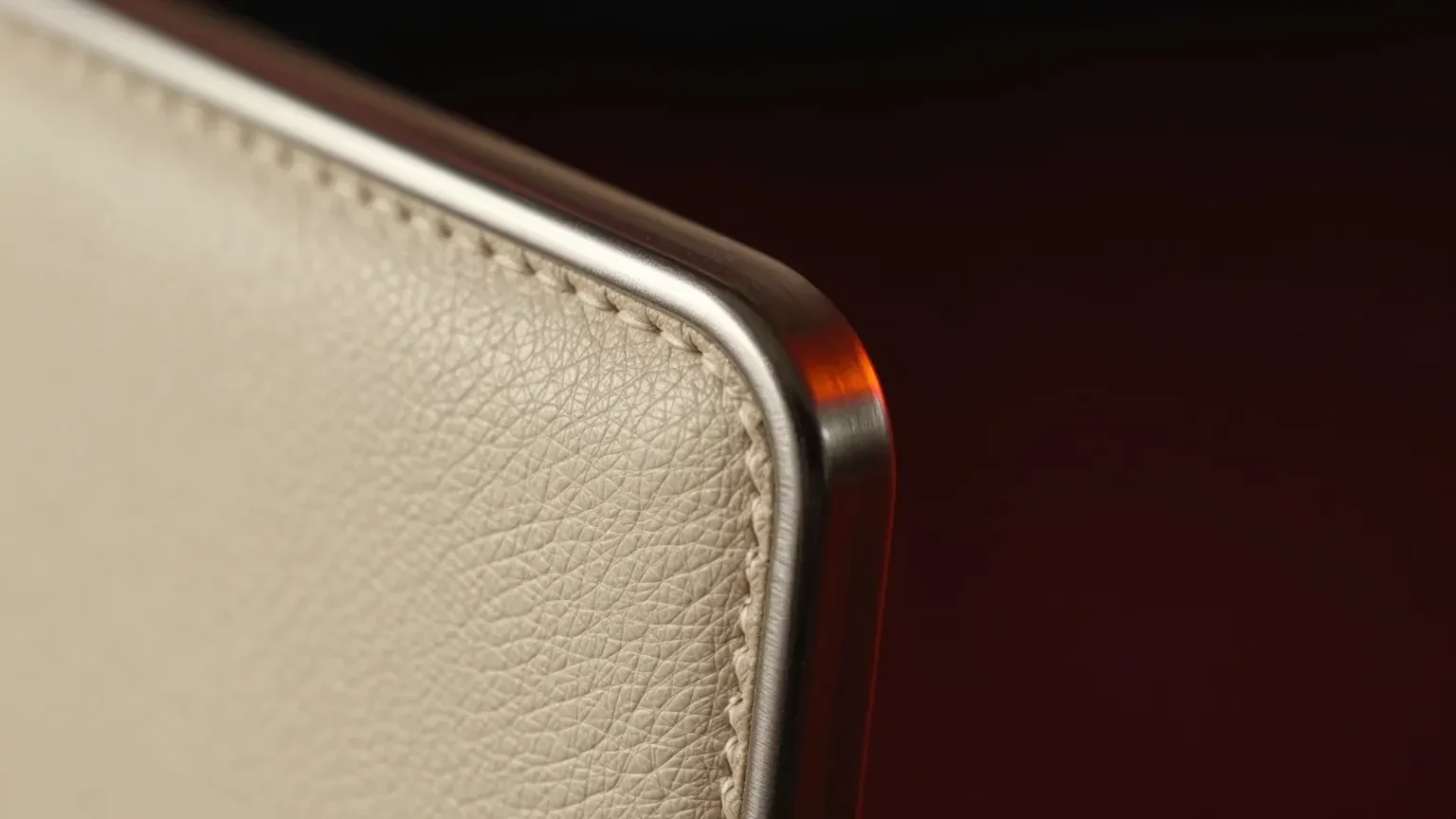
Luxury buyers look closely. Stock imagery and generic renders are noticed immediately. Commission photography or high-end 3D that shows texture: grain of leather, brushed metal, the weight of fabric. Where 3D helps is control: every colorway rendered in identical light, close-ups no lens can get, and products that don't exist yet.
Speed is part of the experience
A luxury site that takes four seconds to show its hero feels cheap, however beautiful it is. The data backs this up. In the Google-commissioned Milliseconds Make Millions study by 55 and Deloitte, a 0.1-second improvement in mobile site speed was linked to a 40.1% increase in luxury shoppers progressing from product page to add-to-basket, the largest effect of any vertical studied. The study notes luxury progression rates start low, so small absolute changes look large in percentages, but the direction is clear.
Practical targets: Google's "good" thresholds of LCP within 2.5 s and INP within 200 ms, on a phone.
Where spectacle fits
Restraint is the default, not a ban. Some moments call for full motion, 3D and film:
- Launches. A new collection or flagship product gets a dedicated page with a hero film and an interactive product. Our product launch website guide breaks down the structure.
- Limited editions. Scarcity justifies theatre. A short-lived page can be bolder than the main site.
- Brand worlds. A campaign microsite where atmosphere is the point.
Keep the spectacle contained to those pages and the core shop calm. That contrast is what makes the launch feel like an event.
Premium website design and awards
Luxury sites often win design awards, because juries reward craft and restraint executed perfectly is hard. If you are weighing whether an award is worth chasing, our view is in Awwwards website design.


